

|
|
Shelley Shwu-Ching Young and Hui-Chun Hung
National Tsing Hua University, Taiwan
In an era witnessing the rapid development of information technology, mobile devices have brought revolutionary changes to learning. A single conventional media platform is not enough for the various mobile devices. Technology-enriched educational environments supported by different devices are important research issues nowadays. To capture the rapid growth of mobile users in Chinese societies, OpenCourseWare (OCW) needs to move their learning models toward the mobile sphere. Therefore, this study reports the three years of empirical experience in implementing the upgraded National Tsing Hua University OCW platform and analyzes how users access the platform with various devices. The results indicate a responsive web design and cloud-computing provide great accessibility to meet the diversity of various mobile devices from Chinese users throughout the world, including 466,429 visits with 264 different mobile devices from 146 territories. Moreover, the proposed solutions make the workflow of OCW production more efficient. The study further discussed the importance of both tablets and smartphones. Moreover, to expand the reach of open educational resources (OER) in Chinese societies, the critical issues of fair use and sustainability of OER should be of concern. The findings of the study provide valuable references for web engineers and educators to explore cross-device online learning using PCs and mobile devices.
Keywords: mobile learning; OpenCourseWare; online courses; Chinese society; cross-device learning
In Western societies, OpenCourseWare (OCW), which was pioneered by Massachusetts Institute of Technology, has shared more than 2,000 courses in English over the past decade (MIT OCW, 2012). Several studies discussed the issues of open educational resources (OER) and OCW in English (d’Oliveira, et al., 2010; OpenCourseWare, 2006; Klebl et al., 2010). However, Chinese users might have language and culture barriers in learning English with OCW. Moreover, few studies focus on the OCW issue in Chinese societies. In an era witnessing the rapid development of information technology, mobile devices have brought revolutionary changes in network information exchange and profoundly influence people’s work and life. In China and Taiwan, 74.5% and 44.32% of the Internet population access the Internet via mobile devices (CNNIC, 2013; TWNIC, 2013). The use of mobile devices could provide greater and easier access to OER anywhere and anytime (Ally & Samaka, 2013; Chaiprasurt & Esichaikul, 2013; Valk, Rashid, & Elder, 2010). To capture the growth of mobile learners in Chinese societies, OCW needs to move their learning models toward the mobile sphere. However, the conventional OCW was designed for desktops and might not display well on mobile devices. However, the single media platform is not enough in the current era of information explosion for various mobile devices. The emergence of various innovative mobile technologies, such as smart phones and tablets, has brought lots of design issues and challenges associated with physical and functional limitations (Fallahkhair et al., 2004; Naismith et al., 2005). Developers have to face restrictions in the mobile phone hardware and the devices’ specifications (Chaisatien & Tokuda, 2009; Kaltofen, Milrad, & Kurti, 2010). To adapt to the capabilities of mobile devices, the digital contents and layout on the OCW need to be redesigned. To date, there has been a lack of research shedding light on these issues. Therefore, these issues are worthy of our investigation.
In the past decade, to expand the delivery of the Chinese OCW around the world, National Tsing Hua University (NTHU), one of the prestigious universities in Taiwan, launched the initial version of the OCW platform based on the open source course management system, Moodle. NTHU OCW features provide top quality higher level Chinese courses delivered by faculty members who have received outstanding teaching awards. Each course contains the lecture videos and some materials, such as course syllabus or lecture slides, in the whole semester freely and openly. In 2010, NTHU started to redesign the platform to target mobile learners. Meanwhile, cloud computing is a newly proposed service model that improves the traditional client-server architecture and aims to ease the workload to guarantee quality of service (Armbrust, et al., 2010; Dikaiakos, 2009; Buyya, 2008). Therefore, the purposes of this study are to document the valuable experiences of redesigning the NTHU OCW platform based on cloud computing and understand how the platform could extend the reach of OCW across various devices to the global Chinese community. The research questions are as follows:
1) What are the challenges of implementing the OCW platform for various mobile devices? What are the solutions? How did NTHU OCW redesign and upgrade its platform based on those solutions? Can the redesigned platform make the publishing flow more efficiently?
2) Who can benefit from NTHU OCW after the cloud-based OCW platform is in operation? What mobile devices do they use to access the learning contents and where are they from?
Thanks to advances in wireless and mobile technologies, it is possible to extend the learning environment far beyond classroom walls and school schedules through the use of mobile devices (Liu, 2007; Traxler, 2007). Mobile technologies have dramatically increased portability in the learning process and constructed a seamlessly integrated learning environment (Joiner, Stanton, & Luckin, 2003; Kraut et al., 2002). Various studies have found using mobile technology can enable learners to become active participants. Students with mobile devices can directly explore knowledge and share their experiences with others. They can learn on their own terms and may therefore tend to devote themselves to study (Looi et al., 2010; Roschelle, 2003; Squire & Klopfer, 2007; Wang et al., 2013). Moreover, mobile learning has been recognized as an effective learning approach (Hung, et al., 2013; Rogers & Price, 2009; Valk, Rashid, & Elder, 2010).
The emergence of innovative mobile technologies has brought up a wide variety of learning activities. Each technology has distinct characteristics and affordances that facilitate different types of learning. For example, those devices have different affordances such as internet connectivity, screen size, portability, and storage and operation systems, which allow learners to reach the distinct format of content in different user-behaviors (Fallahkhair et al., 2004; Naismith et al., 2005; Pemberton et al., 2004). Moreover, mobile devices do not always benefit learning because of various drawbacks, including a small screen, limited input options, and low computational power. We need to rely on an appropriate design to overcome these pitfalls and embrace a broader spectrum of mobile learning practice designs (Ting, 2012). Therefore, we should supply the same content with different qualities at a time to serve the various needs of the target users in different situations to choose or switch their devices to learn OCW.
The idea of open educational resources (OER) was born of technological advances enabling the creation, organization, and dissemination of high-quality openly licensed online educational materials for people everywhere to share, use, and reuse knowledge more easily (Atkins et al., 2007; OLCOS Roadmap, 2007; The William and Flora Hewlett Foundation, 2013). The goal of OpenCourseWare (OCW), pioneered by Massachusetts Institute of Technology (MIT), is to create a global Web to offer open educational resources (OER) over the past decade. OCW nowadays differs from conventional web-based learning because it’s a new and revolutionary method of sharing the contents freely to all audiences (Kim et al., 2006). With the growing functionality of mobile devices, mobile learning offers greater choice to allow teachers to deliver learning materials (Fozdar & Kumar, 2007).
The investigations discovered learners’ demand for using mobile devices enhanced OCW learning (Bateman, Lane, & Moon, 2012; Gomez, et al., 2012). OCW is a great supplement for mobile learners. The use of mobile technology provides OCW learners with an opportunity to reach OER beyond their routine classroom environments in their own time and at their own pace (Baird, Esterhuizen, & Beer, 2010). There are many different kinds of video formats for people to choose from. Various devices are held by users to view those digital contents. They come across problems to find qualified information for their devices (Tracey, 2009).
Previous mobile learning research with regard to OCW and OER have examined how learning materials are designed and delivered for the new generation of learners (Ally, 2005; Patten, Sanchez, & Tangney, 2006; Sharples, Taylor, & Vavoula, 2007). Kukulska-Hulme (2007) discussed mobile usability in educational contexts and emphasized the importance of usability which should be tracked over a longer period. Traxler (2007) examined this relationship in the context of mobile learning and provided information on how mobile technology can be used in informal learning. Fozdar and Kumar (2007) indicated that the use of mobile technology can help in student retention in open and distance learning and allow educational organizations to reach more learners. Mobile devices lend learning to new methods of delivery (Peters, 2007).
Some other research studies have adopted mobile devices to OCW or OER learning: To make sure OERs are truly open and accessible, Rolfe and Griffin (2012) released OERs in multiple formats. Tecnológico de Monterrey in Mexico, with other Mexican higher education institutions, was creating an Internet repository of OER and mobile resources for the instruction and development of educational researchers (Mortera, 2010). Kinshuk and Jesse (2013) presented the mobile authoring tool, MAAIMS, for OER in standardized learning content and demonstrated authoring of authentic learning examples with mobile sensors and location-awareness. Fukuhara, Yamawaki, and Kageyama (2010) introduced the social learning service, “iUniv”, where formal academic contents are used in informal learning situations. Users can access contents with various terminals like iPone, iPad, and smartphone. DeWaard, et al. (2011) explored how the massive open online course (MOOC) format developed by connectivist researchers and used Mobi-MOOC to understand the chaos, emergence, and complexity in education. However, few studies have discussed the challenges and considerations from the view of implementing the OCW platform for various mobile devices. This study examined holistic design issues in terms of platform development, interface design, and multimedia courseware production.
During the educational process, different types of technologies are used to enhance the learning capabilities of students (Kert, 2013). Due to the market of mobile operating systems for smartphones being fragmented – such as Google’s Android, Apple’s iOS, Microsoft’s Windows Phone and RIM’s Blackberry – and all the operating system platforms differing significantly from each other, the multiple mobile devices also differ in development procedures. However, current development methods for mobile applications are mostly based on the Software Development Kits (SDKs) released by the native platform (Kaltofen, Milrad, & Kurti, 2010). Application developers might be forced to choose to support only specific devices or required to develop the application for each platform separately to reach a large audience of users (Heitkötter, Hanschke, & Majchrzak, 2013).
Cross-platform development approaches emerged to address this challenge by allowing developers to implement their apps in one step for a range of platforms, avoiding repetition and increasing productivity. On the one hand, these approaches need to offer suitable generality in order to allow provision of apps for several platforms. On the other hand, they still have to enable developers to capitalize on the specific advantages and possibilities of smartphones.
Heitkötter, Hanschke, and Majchrzak (2013) classified general approaches to cross-platform development of mobile applications and analysed existing cross-platform solutions based on Web technologies like HTML, CSS, and JavaScript. As these differ in their general architecture and their capabilities, it is not obvious which to prefer. We will outline criteria that are important when making a decision as well as evaluate popular approaches to mobile Web apps, such as PhoneGap and Titanium Mobile, according to these criteria (Heitkötter, Hanschke, & Majchrzak, 2013).
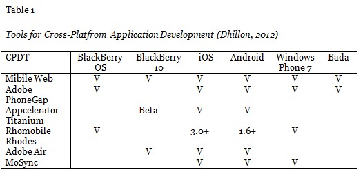
To address these challenges, numerous tools have been created to aid developers in building cross-platform applications. Dhillon (2012) evaluated the features and performance and discussed the development history of existing and future cross-platform development tools. He compared these tools by benchmarking several tools (Table 1). The result indicated that Mobile Web apps offer a quick and simple entrance into cross-platform development. In summary, the maturity of cross-platform approaches reveals that native development is not necessary when implementing mobile applications.
As more devices become able to access the Internet, website designers are finding it harder to predict user context (Gardner, 2011). The World Wide Web Consortium (2005) recognized mobile device variety would slow mobile web growth. The cross-platform approach may prove to be the most efficient method due to its low entry barriers owing to usage of Web technologies such as HTML5, CSS, and JavaScript, which are standardized, popular, and well-supported (Heitkötter, Hanschke, & Majchrzak, 2013). To cope with the highly differentiated capabilities and limitations of mobile devices, the solutions could be deploying multiple versions of their content or rely on adaptation techniques (W3C Working Group, 2005). Responsive web design is a term given to a set of adaptation techniques that allow designers to create a single website that can adapt the layout to viewing contexts across various devices (Marcotte, 2011; WebDesignShock, 2011). J-Query is one of the programing languages including the lightweight cross-browser JavaScript library for responsive web design and can enhance the effective usage of different mobile applications to support different types of browsers (McCormick & De Volder, 2004). J-Query emphasizes interaction between JavaScript and HTML and was used by more than 27% of the most visited websites; jQuery is the most popular JavaScript library currently in use (Na, 2011). Kert (2013) demonstrated the remarkable advantages of J-Query, such as support for different browsers, and indicated J-Query could support and enrich the pedagogical proficiency of courses via different kinds of mobile devices. Therefore, this study adopts web technologies such as jQuery, CSS3, and HTML5 to add the necessary functional, aesthetic, and multimedia tools for mobile user behavior on the Web.
Makdin, a cross-device learning platform, may lead to duplication in the transformation of different formats of video for various devices. To resolve this problem, cloud computing supports resource management, time scheduling, and format converting. The term cloud originates from accessing storage elements and software services on the Internet (Knorr & Gruman, 2008). Cloud computing is defined as a technology using the Internet as a medium, which is the concept that has evolved to distributed computing, grid computing, or classical high performance computing (Vaquero, Lindner, Rodero-Merino, & Caceres, 2009; Yoon & Kim, 2010). Cloud computing provides the foundation for the integration of platform and technology which can be used as a huge workspace, repository, platform, and infrastructure (Kim, Song, & Yoon, 2011). The cloud services invocation from the handset enables mobile applications that are not limited by storage space and processing power (Paniagua, Srirama, & Flores, 2011).
Cloud computing provides services at the infrastructural level (IaaS) or platform level (PaaS) or at the software level (SaaS). These kinds of applications access the shared pool of computing resources provided by the cloud on demand, and thus are able to handle tasks that require data-intensive processing. Studies indicate that the development of cloud-based computing can support mobile devices to enhance learning experiences for fostering flexibility and seamless data access (Johnson, Levine, Smith, & Stone, 2010; van’t Hooft, 2008). Cloud computing and its flexibility have been identified as possible powerful components to provide people with the opportunities to distribute content and facilitate sharing, networking, communication, and the production and publishing of OER (Kop & Carroll, 2011; Wheeler & Waggener, 2009) .
This study was conducted in a natural setting with the NTHU OCW production team from 2010 to 2013, including two phases: (1) system design and implementation and (2) data collection and analysis.
In the first phase, the researchers participated in the production team to explore how to redesign and make the system compatible with different mobile devices. The investigation of the system design and implementation was conducted from 2010 to 2012. The initial platform NTHU OCW was launched in 2008 based on the open source course management system Moodle. In 2010, to engage more learners and extend the reach and impact of NTHU OCW, NTHU adopted a cloud-based platform aiming to support various specialized technologies which tend to be used in different learning settings in various ways. The production team included one faculty, two programmers, one technical assistant, and 15 course developers. All participants needed to discuss and identify the problems and issues related to the platform based on actual student needs and explore how to design the OER to be displayed on different mobile devices. Both quantitative and qualitative methods were employed in this study. The qualitative data were derived from observations, semi-structured interviews, and journal entries. All members of the OCW production team were interviewed and their preparation timeline as well as how well they cooperated with one another were observed. A journal was kept while making the instructional materials.
In the second phase, to understand who and how the potential users come to visit the upgraded NTHU OCW platform, Google Analytics (GA), a kind of web analytics approach for measuring Web site effectiveness, and the web site click-through logs were adopted to collect web usage data from Jan 1, 2012 to Aug 31, 2013 (Figure 1) and the operation systems of the handheld devices at the users’ side. Google Analytics set out to collect data about user interactions across websites based on web site click-through logs and analytics. Variables included page URL, user location, and source (referring link). Data were exported as comma-separated values text files which were opened in SPSS for processing. The quantitative data collected via GA can help us measure site effectiveness and understand web site performance. In this phase, data was gathered from web matric as the observation is more likely to be authentic as the user is less aware of the observation. The observation does not interrupt the users when they are learning. Sources for web matric data are log files of servers and applications which can be obtained without disturbing the user. Examples of the outcome of such analysis are statistics of the objective information, for example the number of times it has been read or downloaded, or about the users, for example the information they clicked, downloaded, and so on. Therefore, the reliability of the research was considered acceptable.

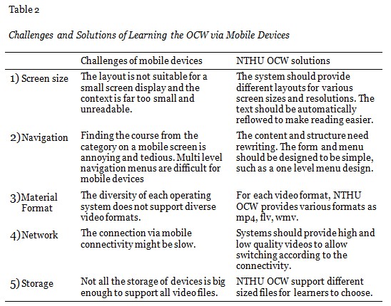
The data collected from the interviews indicated the production team faced several challenges in redesigning the platform. The challenges included the following: (1) screen size, (2) navigation, (3) material format, (4) network, and (5) storage (Table 2). These five challenges are related and could be discussed as two aspects: the limitation of screen size and the mobile network connectivity. In terms of screen size, the content designed for desktops is not suitable for small and diverse screen displays. For this reason, the menu bar and the items on the webpage designed for desktops with a mouse are difficult to use on the screen of mobile devices. Therefore, the content, layout, and structure should be redesigned to be simple and auto-adjustable. In terms of mobile network connectivity, those learning with mobile devices might not have a stable and high-speed network connection. The platform should deliver videos in streaming media format in case of interruption of the internet connection. Moreover, videos should be provided in different formats with different qualities for learners to choose, depending on their mobile network connectivity, storage, and operating system.
Based on the solutions proposed in this study, the production team adopted the techniques of responsive design and cloud-computing to redesign the system. From the view of the learner, the solutions we proposed focus on improving the reading experience of articles from the Moodle-based to cloud-based system in the following ways.
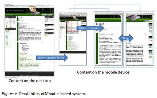
(1) Readability
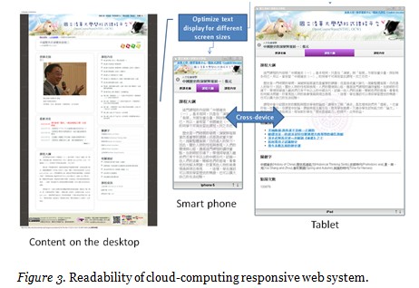
In the Moodle-based system, when users can access the content via mobile device, the information is the same as on the desktop but with unreadable small text. If users want to read clearer content, they can spread it on the screen to focus on a portion of content with a bigger font size. However users can not read the whole sentence on the small screen. In this case, it leads to poor readability (Figure 2). However, in the cloud-based responsive system, responsive design can detect devices by inspecting the web browser’s information and matching them with suitable and auto-adjustable layouts for desktops or mobile devices (Figure 3).
(2) Functionality
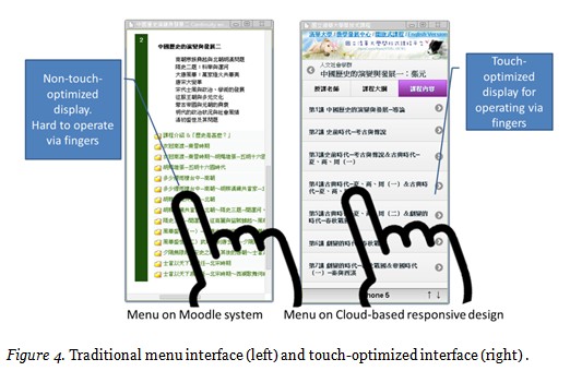
In the system implementation, NTHU OCW used cloud computing to extend and encode different media formats and combine the responsive web designs based on CSS3, HTML5, and j-Query. Using j-Query as a touch-optimized web framework, jQuery Mobile is a HTML5-based user interface system designed to make responsive web sites that are accessible on all smartphone, tablet, and desktop devices. For example, the menu link on the traditional Moodle is less friendly for users to operate on the touch screen via fingers. However, the cloud-based responsive web design has a touch-optimized interface (Figure 4).
The multimedia streaming application is one of the major ways of producing digital learning materials in this study. NTHU applied a multiple media encoder service platform to construct a top-down architecture combining the existing application with modularized application programming interface in an IaaS cloud service from a bottom-up narrative. Therefore, the OCW files were created in various formats, such as MP4 and WMV, suitable for different devices. The videos published in multiple formats could ensure the accessibility of learners with different needs. Moreover, these videos can meet the technical standards required to ensure OER are interoperable across a number of devices, from computers, tablets, to mobile phones, and complying with Windows, Android, and iOS platforms.
(3) System architecture
Figure 5 shows the system architecture overview of the Moodle-based and cloud-based platform. In the cloud-based platform, after the production team finishes the capturing and editing of lecture videos, the videos are uploaded to network-attached storage (NAS) via web server. All the video waits for the command of cloud management server and schedule server to encoding. Encoding cloud contain a group of computing units which share its computing power. Via encoding cloud, all scheduled lecture videos transcoded into different video formats with different qualities are saved into the database and are ready for access by various devices via a responsive web server.

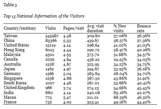
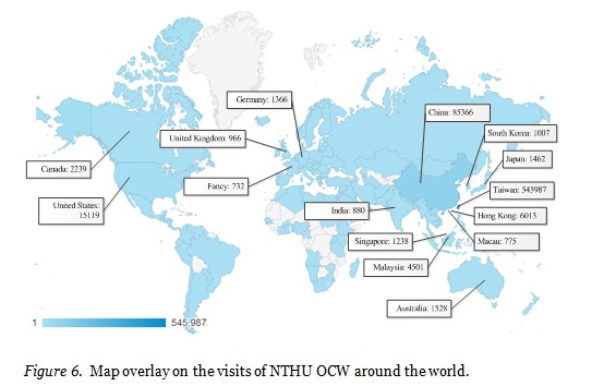
The data from the web metrics tool indicate the platform has been utilized by users from 146 territories around the world from Jan-01-2012 to Aug-13. Table 3 shows the top 15 countries/territories from 146 countries/territories, including Taiwan (545,987 visits), China (85,366 visits), United States (15,119 visits) and so on. Moreover, Figure 6 indicates the distribution of the visits on the global map overlay.
To discuss where the learner comes from, this study analyzes the visits from 146 territories and finds the users visiting NTHU OCW to learn Chinese OER are mainly from both Chinese-speaking territories (Taiwan, China, and Hong Kong, et al.) and English-speaking territories (United States, Singapore, and Canada, et al.) (Table 4).

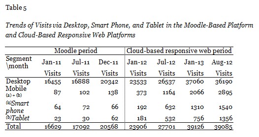
To explore the devices of 466,429 visits, data from GA from Jan-01-2012 to Aug-13 reveals those visits access the platform via 264 different mobile devices, including desktops (95.42%), mobile devices (2.61%), and tablets (1.97%). To further understand the difference between the Moodle period and the cloud-based period, Table 5 indicates the growth trends of those devices have increased in the given period; the data extracted every six months indicate that both smart phones and tablets show an increase in amount and percentage. In the Moodle period, the number of smart phones per month increased from 64 (0.28%) to 66 (0.30%) and the number of tablets increased from 23 (0.16%) to 62 (0.22%). In the cloud-based responsive web period, the number of smart phones per month increased from 192 (0.80%) to 1,540 (3.94%) and the number of tablets increased from 181 (0.76%) to 1,356 (3.47%). These results indicate there are learning needs for both tablet users and smart phone users. The design of the OCW platform should pay special attention to the growing needs of these two groups of users. Moreover, the result indicates that the cloud-based responsive web improves the mobile access more efficiently than the Moodle period.
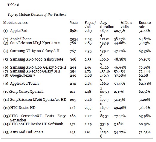
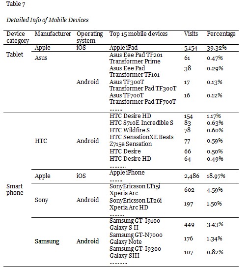
Table 6 gives information on the top 15 mobile devices from a total 264 different mobile devices. To categorize those devices by the manufacturers and operating systems, the data show the diversity of the mobile devices (Table 7). This result indicates NTHU OCW was accessible by the major devices with iOS and Android operating systems. This result proves the system benefits learners with a cross-platform for various devices.
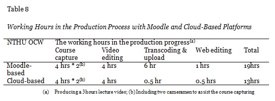
NTHU OCW features provide the courses with various video formats. The effort required to produce lecture videos is especially costly. For each course, the production team must compile course materials from the faculty and ensure proper video formats for global distribution. In this study, after NTHU upgraded the platform, the production team noticed the cloud-based solution was more efficient than the Moodle version and reduced working hours by 30%. Table 8 indicates the steps of the workflow in the initial Moodle-based version and the upgraded cloud-based version platform. The difference of hours in the transcoding and uploading videos step is based on the labor-based operation in the Moodle-based, which has been replaced with cloud computing in the cloud-based system. Therefore, when producing a three hour lecture video, the production team had to spend 19 hours with the Moodle-based platform; they only spent 13 hours with the cloud-based solution.
From an entirely mobile perspective, according to the International Data Corporation (IDC, 2013), tablet shipments (128.3 million) in 2012 are much less than smartphone shipments (722.4 million). However, in this study, the web visits of tablets (40.33%) are much closer to the visits of smart phones (57.83%). To understand the actual uses of the two devices, this study further analyzes the pages per visit by mobile devices. The top five devices that browse the most pages per visit on NTHU OCW are Amazon Kindle Fire (22 pages / visit), Acer A101 Vangogh (17 pages / visit), Samsung GT-P3110 Galaxy Tab (15 pages / visit), ViewSonic ViewPad (10 pages / visit), and Asus Eee Pad Transformer TF101G (9 pages / visit), which are all tablet devices. On average, this study found learners view more pages per visit when browsing with a tablet compared to a smartphone. This result is consistent with White’s (2013) report that internet users prefer to use tablets for more in-depth visits. Therefore, although smartphones remain much more common, we cannot ignore tablets as potentially ideal internet browsing tools for learning when we are promoting OCW.
In view of the wide education markets in Chinese societies, the amount of visits of users from China and Taiwan in this study might not be parallel to the population proportion of those two territories. While exploring our NTHU OCW on the Internet, the researchers found more than 200 lecture videos produced by NTHU OCW have been copied and redistributed to popular websites in China. Those videos include the whole package of the lecture contents, for example, of the courses entitled “Calculus”, “Continuity and Change in Chinese History”, just to name a few. Besides, those copied courses are listed in the top 10 popular websites in China, which are also in the top 20 Globe websites. This phenomenon might explain why visits from China to our local NTHU OCW are not significantly larger than the visits from Taiwan. This is a critical issue worthy of our attention when academic communities have been working diligently to contribute to the diffusion of OER in Chinese societies. From the educational perspective, we encourage many third parties to copy and redistribute the content of NTHU OCW, which can further explain the value and popularity of NTHU OCW in Chinese online communities and these websites could accelerate the delivery of NTHU OCW to every corner of Chinese society. However, from a copyright perspective, when the professors dedicate their time, intellect, and energy to making high-quality educational resourses for non-profit sharing online, the uses of NTHU OCW from the local sites should be cited properly. However, almost none of the websites copied to China gave credit to NTHU OCW. What is worse, most of the copied videos have added their own website logo and inserted advertisements for commercial purposes. Thus, this is an issue of serious concern.
The spirit of OCW is providing free and open access to educational resources, but it does not mean users are free of responsibility. If we want educational resources to be really open and free, in the meantime, the owners of OER should be appropriately protected and respected. Therefore, the sustainability of open education resources will be valued and remain feasible.
In the ubiquitous learning environment, we can access OCW not merely on the desk or in school, but also in our pockets. As technology evolves, it is important to keep up with the changes to benefit learning. This study shares our longitudinal study results and experiences over a four-year period on how cross-platform technology could be applied to help students access OER, addresses the design issues and challenges of cross-platform development, and provides suggestions and solutions for OER to be accepted and effective via the various devices. This study proposes a holistic design in terms of the platform, digital multimedia courseware production, which are meaningful for those who want to know the cross-platform development issues on OER or who want to explore OCW in Chinese communities. Our conclusions are listed as follows:
1) The main challenge is to support these inevitable technologies, given the diversity of mobile devices, including solutions for screen size, navigation, material format, network, and storage. The proposed solutions are cloud-computing and responsive web design. Cloud-computing is more efficient than Moodle, saving up to 30% of working hours in transcoding the video format for various devices. The responsive web design upgrades the conventional platform for various mobile devices and optimizes the reading experience of users by adapting the context of the OCW platform to the various devices – desktops, tablets, and smart phones.
2) A responsive web design and cloud-computing provide greater accessibility for different mobile devices and allow Chinese users around the world to reach the NTHU OCW freely. The platform has benefited learners with a cross-platform system enabling various devices from different areas. The OER on our platform can be easy to view on the device of personal choice anywhere with an internet connection. A total of 466,429 visits with 264 different mobile devices from 146 territories around the world have accessed NTHU OCW. Moreover, the visits via mobile devices, including both smart phones and tablets, have been steadily increasing month after month.
To expand OER in Chinese societies, the intellectual property rights issue of striking a balance between “open access” and “inappropriate copy and use” is crucial and worthy of our further concern. This study makes several contributions. Firstly, it gives a comprehensive overview of current approaches to cross-platform development for OER. Secondly, it demonstrates how to adopt cloud computing services and responsive web design to redesign and develop the OCW platform and to ensure accessibility and interoperability across various devices. Thirdly, we present a detailed analysis of Moodle-based and cloud-based approaches. This study reveals tablets could be considered as a potential tool for in depth visits. The OCW platform needs to put its emphasis on both tablets and smartphones. We expect the NTHU OCW will create new opportunities as a desirable platform and a popular source of OER in Chinese societies. In the future, the researchers will continue to explore learning behaviors via various mobile devices and investigate the learners’ motivation and learning outcomes. More results yielded from this series of studies will be shared.
The authors would like to thank the sponsorship from the Ministry of Science and Technology, Taiwan, under the project code of NSC 102-2511-S-007 -001 -MY3. Moreover, many thanks go to the Center for Teaching and Learning Development at National Tsing Hua University. Without its support, this study would not be possible.
Ally, M. (2005). Multimedia information design for mobile devices. In M. Pagani (Ed.), Encyclopedia of multimedia technology and networking. Hershey, PA : Idea Group Inc..
Ally, M., & Samaka, M. (2013). Open education resources and mobile technology to narrow the learning divide in online courses. The International Review of Research in Open and Distance Learning, 14(2), 14–27.
Armbrust, M., A. Fox, et al. (2010). “A view of cloud computing.” Commun. ACM, 53(4), 50-58.
Atkins, D. E., Brown, J.S., & Hammond, A.L. (2007). A review of the open educational resources (OER) movement: Achievements, challenges, and new opportunities. Report to The William and Flora Hewlett Foundation. Retrieved from http://www.hewlett.org/uploads/files/ReviewoftheOERMovement.pdf.
Baird, N., Esterhuizen, N., & Beer, K. J. de. (2010). Audio as medium for content distribution (providing access to knowledge). In Open Ed 2010 Proceedings (pp. 17–21). Barcelona: UOC, OU, BYU. Retrieved from http://openaccess.uoc.edu/webapps/o2/handle/10609/4882
Bateman, P., Lane, A., & Moon, B. (2012). An emerging typology for analysing OER initiatives. In Cambridge 2012: Innovation and Impact – Openly Collaborating to Enhance Education, a joint meeting of OER12 and OpenCourseWare Consortium Global 2012, 16-18 April 2012, Cambridge, UK.
Buyya, R., Y. Chee Shin, et al. (2008). Market-oriented cloud computing: Vision, hype, and reality for delivering IT services as computing utilities. High Performance Computing and Communications, 2008. HPCC ‘08. 10th IEEE International Conference.
Caudill, J. G. (2007). The growth of m-Learning and the growth of mobile computing: Parallel developments. International Review of Research in Open and Distance Learning, 8(2). 1-13.
Chaiprasurt, C., & Esichaikul, V. (2013). Enhancing motivation in online courses with mobile communication tool support: A comparative study. The International Review of Research in Open and Distance Learning, 14(3), 377–401.
Chaisatien, P., & Tokuda, T. (2009). A web-based mashup tool for information integration and delivery to mobile devices. Proceedings of the 9th International Conference on Web Engineering, 489-492.
CNNIC. (2013). Statistical report on internet development in China. China Internet Network Information Center. Retrieved from http://www1.cnnic.cn/IDR/ReportDownloads/
DeWaard, I., Abajian, S., Gallagher, M. S., Hogue, R., Keskin, N., Koutropoulos, A., & Rodriguez, O. C. (2011). Using mLearning and MOOCs to understand chaos, emergence, and complexity in education. International Review of Research in Open and Distance Learning, 12(7), 94–115.
Dhillon, S. (2012). An evaluation framework for cross-platform mobile application development tools. The University of Guelph. Retrieved from http://atrium.lib.uoguelph.ca/xmlui/handle/10214/4949
Dikaiakos, M. D., D. Katsaros, et al. (2009). Cloud computing: Distributed internet computing for IT and scientific research. Internet Computing, 13(5), 10-13.
d’Oliveira, C., Carson, S., James, K., & Lazarus, J. (2010). SPORE series winner. MIT OpenCourseWare: Unlocking knowledge, empowering minds. Science, 329, 525–526. doi:10.1126/science.11826962
Fallahkhair, S., Pemberton, L., & Masthoff, J. (2004). A dual device scenario for informal language learning: Interactive television meets the mobile phone. In Kinshuk, Looi, C., Sutinen, E., Sampson, D., Aedo, I., Uden, L., and Kahkonen, E. (Eds), The 4th IEEE International Conference on Advanced Learning Technologies (ICALT 2004) (pp.16-20).
Fozdar, B. I., & Kumar, L. S. (2007). Mobile learning and student retention. International Review of Research in Open and Distance Learning, 8(2), 1–18.
Fukuhara, Y., Yamawaki, S., & Kageyama, Y. (2010). Bridging formal / informal learning. In Open Ed 2010 Proceedings, 1–8.
Gardner, B. (2011). Responsive web design: Enriching the user experience. Connectivity and the User Experience, 11(1), 13–19.
Ghosh, R., Longo, F., Naik, V. K., & Trivedi, K. S. (2010). Quantifying resiliency of IaaS Cloud. In 2010 29th IEEE Symposium on Reliable Distributed Systems (pp. 343–347). IEEE. doi:10.1109/SRDS.2010.49
Gomez, S., Callaghan, L., Eick, S. A., Carchidi, D., Carson, S. & Andersson, H. (2012). An institutional approach to supporting open education: A case study of OpenCourseWare at Massachusetts Institute of Technology. In Cambridge 2012: Innovation and Impact – Openly Collaborating to Enhance Education, a joint meeting of OER12 and OpenCourseWare Consortium Global 2012, 16-18 April 2012, Cambridge, UK.
Heitkötter, H., Hanschke, S., & Majchrzak, T. A. (2013). Evaluating cross-platform development approaches for mobile applications. In J. Cordeiro & K.-H. Krempels (Eds.), Web information systems and technologies (Vol. 140, pp. 120–138). Springer Berlin Heidelberg. doi:10.1007/978-3-642-36608-6_8
Hung, P. H., Hwang, G. J., Lin, Y. F., Wu, T. H., & Su, I. H. (2013). Seamless connection between learning and assessment applying progressive learning tasks in mobile ecology inquiry. Educational Technology & Society, 16(1), 194–205.
IDC (2013). Mobility reigns as the smart connected device market rises 29.1% in 2012 driven By tablet and smartphone growth, according to IDC. Retrieved from http://www.idc.com/getdoc.jsp?containerId=prUS23958513#.UTCkuDd4DlZ.
Johnson, L., Levine, A., Smith, R., & Stone, S. (2010). The 2010 Horizon Report. Austin, TX: The New Media Consortium.
Joiner, R., Stanton, D., & Luckin, R. (2003). Guest editorial: Children and new technology. Journal of Computer Assisted Learning, 19, 145–148.
Kaltofen, S., Milrad, M., & Kurti, A. (2010). A cross-platform software system to create and deploy mobile mashups. In B. Benatallah, F. Casati, G. Kappel, & G. Rossi (Eds.), ICWE’10 Proceedings of the 10th international conference on Web engineering (pp. 518–521). Springer-Verlag Berlin, Heidelberg.
Kert, S. B. (2013). Using J-Query mobile technology to support a pedagogical proficiency course. Journal of Educational Computing Research, 48(4), 431–445. doi:10.2190/EC.48.4.b
Kim, S., Song, S.-M., & Yoon, Y.-I. (2011). Smart learning services based on smart cloud computing. Sensors, 11(8), 7835–50. doi:10.3390/s110807835
Kim, H., Kwack, D., Park, I., Song. S., Lee, I., & Seoh, J. (2006). Research of developmental strategy for e-learning globalization. KERIS (Korea Education & Research Information Service) Research Paper. KR 2006-5.
Kinshuk, & Jesse, R. (2013). Mobile authoring of open educational resources as reusable learning objects in online courses. The International Review of Research in Open and Distance Learning, 14(2), 28–52.
Klebl, M., Krämer, B. J., & Zobel, A. (2010). From content to practice: Sharing educational practice in edu-sharing. British Journal of Educational Technology, 41(6), 936–951. doi:10.1111/j.1467-8535.2010.01134.x
Knorr, E., & Grumman, G. (2008). What cloud computing really means. Cloud Computing. Retrieved from http://www.infoworld.com/d/cloud-computing/what-cloudcomputing-really-means-031
Kraut, R., Kiesler, S., Boneva, B., Cummings, J. N., Helgeson, V., & Crawford, A. M. (2002). Internet paradox revisited. Journal of Social Issues, 58, 49–74.
Kop, R., & Carroll, F. (2011). Cloud computing and creativity: Learning on a massive open online course. Retrieved from http://www.eurodl.org/?p=special&sp=articles&inum=2&article=457
Kukulska-hulme, A. (2007). Mobile usability in educational contexts : What have we learnt? International Review of Research in Open and Distance Learning, 8(2).
Looi, C. K., Seow, P., Zhang, B. H., So, H. J., Chen, W. L., & Wong, L. H. (2010). Lever- aging mobile technology for sustainable seamless learning: A research agenda. British Journal of Educational Technology, 41, 154–169.
Liu, T. C. (2007). Teaching in a wireless learning environment: A case study. Educational Technology & Society, 10(1), 107-123.
Marcotte, E. (2011). Responsive web design. A book apart. Retrieved from http://www.abookapart.com/products/responsive-web-design
McCormick, E., & Volder, K. D. (2004): JQuery: Finding your way through tangled code. Companion to the 19th annual ACM SIGPLAN conference on Object-oriented programming systems, languages, and applications, Vancouver, BC, Canada, 19, 9–10
Mortera, F. (2010). Innovative applications: Open educational resources and mobile resources repository for the instruction of educational researchers in Mexico. In Open ED 2010 Proceedings. Barcelona: UOC, OU, BYU.
Na, D. Y. (2011). The what, why, and how of mobile applications. Connectivity and the User Experience, 11(1), 20–26.
Naismith, L., Lonsdale, P., Vavoula, G. & Sharples, M. (2005). Literature review in mobile technologies and learning. Nesta Futurelab: Bristol.
OLCOS Roadmap (2007). Open educational practices and re-sources: OLCOS Roadmap 2012. Salzburg Research / EduMedia Group.
OpenCourseWare. (2012). Site statistics: MIT OpenCourseWare. Retrieved from http://ocw.mit.edu/about/site-statistics/
OpenCourseWare. (2006). Unlocking knowledge, empowering minds. Retrieved from http://cne.fct.unl.pt/file.php/104/ocw/_2006_Shigeru_Miyagawa_MIT_OCW.pdf
Paniagua, C., Srirama, S. N., & Flores, H. (2011). Bakabs: Managing load of cloud-based web applications from mobiles. In Proceedings of the 13th International Conference on Information Integration and Web-based Applications and Services - iiWAS ’11 (pp. 485–490). New York, New York, USA: ACM Press. doi:10.1145/2095536.2095636
Patten, B., Sanchez, I. A., T& angney, B. (2006). Designing collaborative, constructionist and contextual applications for handheld devices. Computers & Education, 46, 294-308.
Peters, K. (2007). Connected future. International Review of Research in Open and Distance Learning, 8(2).
Rogers, Y., & Price, S. (2009). How mobile technologies are changing the way children learn. In A. Druin (Ed.), Mobile technology for children (pp. 3-22). Boston, MA: Morgan Kaufmann.
Rolfe, V., & Friffind S. (2012) Using open technologies to support a healthy OER life cycle. In Proceedings of Cambridge 2012: Innovation and Impact – Openly Collaborating to Enhance Education, a joint meeting of OER12 and OpenCourseWare Consortium Global 2012. 16-18 April 2012, Cambridge, UK.
Roschelle, J. (2003). Keynote paper: Unlocking the learning value of wireless mobile devices. Journal of Computer Assisted Learning, 19(3), 260-272.
Sharples, M., Taylor, J., & Vavoula, G. (2007). A theory of learning for the mobile age. In R. Andrews & C. Haythornthwaite (Eds.), The Sage handbook of elearning research (pp. 221-47). London: Sage.
Squire, K., & Klopfer, E. (2007). Augmented reality simulations on handheld computers. Journal of the Learning Sciences, 16(3), 371–413.
The William and Flora Hewlett Foundation. (2013, September 25). Open educational resources. Retrieved from http://www.hewlett.org/programs/education-program/open-educational-resources
Ting, Y. (2012). The pitfalls of mobile devices in learning: A different view and implications for pedagogical design. Journal of Educational Computing Research, 46(2), 119–134.
Traxler, J. (2007). Defining, discussing, and evaluating mobile learning: The moving finger writes and having write. International Review of Research in Open and Distance Learning, 8(2), 1-12.
Tracey, R. (2009). Instructivism, constructivism, or connectivism? Retrieved from http://ryan2point0.wordpress.com/2009/03/17/instructivism- constructivism-or-connectivism/
TWNIC. (2013). Wireless internet usage in Taiwan. Retrieved from http://statistics.twnic.net.tw/item04.htm
Valk, J., Rashid, A. T., & Elder, L. (2010). Using mobile phones to improve educational outcomes : An analysis of evidence from Asia. The International Review of Research in Open and Distance Learning, 11(1), 13–14.
Van’t Hooft, M. (2008). Mobile, wireless, connected: Information clouds and learning. In BECTA (Ed.), Emerging technologies for learning, Vol. 3 (pp. 30–46). Coventry, England: BECTA.
Vaquero, L M., Lindner, L M., Rodero-Merino, L., & Caceres, J. (2009). A break in the clouds: Towards a cloud definition. Computer Communication Review, 39(1), 50-55,
W3C Working Group. (2005). Scope of mobile web best practices. Retrieved from http://www.w3.org/TR/mobile-bp-scope/.
Wang, Y. S., Young, S. S. -C., & Jang, J. S. -R. (2013). Using tangible companions for enhancing learning English conversation. Journal of Educational Technology & Society, 16(2), 296-309.
WebDesignShock. (2011). Responsive web design, most complete guide. Retrieved from http://www.webdesignshock. com/responsive-web-design/
Wheeler, B., & Waggener, S. (2009). Shaping the promise of cloud computing for higher education. Educause Review, November/December 2009, 52-66
White, T. (2013). Tablets trump smartphones in global website traffic. Retrieved from http://blogs.adobe.com/digitalmarketing/digital-index/tablets-trump-smartphones-in-global-website-traffic/
Yoon, Y., & Kim, S. (2010). Mobile cloud computing technology. National IT Industry Promotion Agency (NIPA), 1439, 28-39.