
Figure 1. Illustration of a Complex Adaptive System (Innovation Labs Strategic Solutions, 2007).
Volume 18, Number 5
Elizabeth Archer and Glen Barnes
University of South Africa
During this age of data proliferation, heavy reliance is placed on data visualisation to support users in making sense of vast quantities of information. Informational Dashboards have become the must have accoutrement for Higher Education institutions with various stakeholders jostling for development priority. Due to the time pressure and user demands, the focus of development process is often on designing for each stakeholder and the visual and navigational aspects. Dashboards are designed to make data visually appealing and easy to relate and understand; unfortunately this may mask data issues and create an impression of rigour where it is not justified. This article proposes that the underlying logic behind current dashboard development is limited in the flexibility, scalability, and responsiveness required in the demanding landscape of Big Data and Analytics and explores an alternative approach to data visualisation and sense making. It suggests that the first step required to address these issues is the development of an enriched database which integrates key indicators from various data sources. The database is designed for problem exploration allowing users freedom in navigating between various data-levels, which can then be overlaid with any user interface for dashboard generation for a multitude of stakeholders. Dashboards merely become tools providing users and indication of types of data available for exploration. A Design Research approach is shown, along with a case study to illustrate the benefits, showcasing various views developed for diverse stakeholders employing this approach, specifically the the Digital Decision Network Application (DigitalDNA) employed at Unisa.
Keywords: dashboards, big data, management information systems, data-use
The aim of the article is to explore sound approaches of meeting stakeholder data sense-making requirements in the era of over-whelming data demand and supply, while maintaining data integrity, consistency, and flexibility. Traditionally higher education institutions have access to relatively large data sets and tools for analysis. This is growing exponentially with the ever increasing amount of digital student data that can be harvested and analysed, as well as increased technological and analytical capabilities (Wishon & Rome, 2012). Analytics has been described as the "new black" (Booth, 2012), and student data as the "new oil" (Watters, 2013). The 2013 NMC New Horizon report: Higher Education Edition (New Media Consortium, 2013) identifies learning analytics as one of the key emerging technologies to enter mainstream use from 2015-2016. The report (New Media Consortium, 2013) also identifies dashboards as a key technology in leveraging the power of data at all stakeholder levels. Unfortunately, the current focus and approach to dashboard development will not be able to meet the rapidly growing demands of supporting sense-making in the world of big data, particularly in the Higher Education (HE) environment.
The authors therefore suggest a paradigm shift embracing much of current leadership thinking, which focusses on a Complex Adaptive Systems (Choi, Dooley, & Rungtusanatham, 2001; Hodgson, 2016; McGreevy, 2008). This allows for more responsive organisations and embraces futurist thinking about education, the changing face of employment and graduateness (Archer & Chetty, 2013; Bridgstock, 2009; Hodgson, 2016; Yorke, 2011). This being said, the focus of this paper is not the debate around Complex Adaptive Systems (CAS) in leadership and management, as this has been extensively debated (For example Choi et al., 2001; Davis & Blass, 2007; Dooley, 1997; Dougherty, Ambler, & Triantis, 2016; McGreevy, 2008; Van der Merwe & Verwey, 2008). The article focuses on how various Higher Education (HE) stakeholders, particularly in an Open and Distance Environment, may be provided, with timely, appropriately, quality assured, and flexibly represented information. The purpose of such an approach would be to equip stakeholders to deal with the dynamic nature of and the constantly increasing demands made of Higher Education globally, as well as nationally (Department of Education [DoE], 1997; UNESCO, 1998, 2015), and Open and Distance Learning in particular (Department of Higher Education and Training [DHET], 2014).
The case is illustrated employing data pertaining to HE teaching and learning, but is also already being applied in the context of Research, as well as Estate and Space data at Unisa. The paper should not be confused with work on learning analytics, but relates to information sense-making approaches in HE (which may include benefits in the fields of Learning Analytics and Academic Analytics, but are not limited to these). In particular a novel approach is suggested which questions the foundational principles and dominant current thinking around Dashboard design that focuses on visualization and memorability (Abd-elfattah, Alghamdi, & Amer, 2014; Borkin et al., 2013; Cook, Grinstein, & Whiting, 2014; Few, 2006, 2007; Newman & Elbourne, 2004).
The approach is particularly powerful as it ensures a centralised, quality controlled database, which allows users at many stakeholder levels the flexibility and autonomy to find and explore data in diverse ways to investigate trends and possible contributors to such trends, as well as possible avenues for solutions. The is congruent with a CAS approach to leadership in the dynamic, and currently highly volatile environment of Higher Education globally and in South Africa (#feesmustfall & #rhodesmustfall) (Council on Higher Education, 2016; Pillay, 2016). CAS allows for responsiveness through: emergence, contextually sensitive co-evolution, being sub-optimal (good enough), embracing variety for creativity, employing connectivity within nested systems, simplicity of rules, as well as constant iterations of self-organisation on the spectrum between equilibrium and chaos. These principles are embodied in the DigitalDNA system illustrated in this article.
With the exponential growth of data, with multiple complex relationships, differing constraints, the ever changing environment, uncertainty and time pressure, problem-solving and decision-making can be overwhelming. Dashboards have emerged as a technology to enable stakeholders to engage with the data effectively through various data visualisations (Abd-elfattah et al., 2014). A dashboard can be defined as: "a visual display of the most important information needed to achieve one or more objectives; consolidated and arranged on a single screen, so the information can be monitored at a glance" (Few, 2006, p. 26). Dashboards started to gain traction in the 1980's in the business world and have since gained popularity in Higher Education (Newman, Thomas, & Webber, 2014). Many tools have been developed for the purpose of designing dashboards and disseminating information in graphic formats, these include IBM Cognos, Oracle BI Foundation Suite, SAS Enterprise Intelligence Platform, SAP Business Object BI Platform, MicroStrategy, QlikView, and Web Focus, amongst others. Verbert, Govaerts, Duval, Parra, and Klerkx (2014, p. 1505-1506) document and compare 24 different Learning Analytics dashboards alone.
The proliferation of tools and demands by various stakeholders for immediate development of their own personal dashboards, has often lead to a focus on the visualisation design aspects of the dashboards or the particular functionality of the tools at the expense of the message being communicated. Dashboards are by definition custom designed and as such the design process often starts with determining the stakeholder needs and elements to be present in the dashboard. Once this is determined, the required data is accessed, transformed, and integrated from various data sources in order to provide the data for the visualisation. This results in a multitude of smaller enriched data sources, each designed to service a particular dashboard. This proliferation makes it more complex to apply changes to business rules consistently, be responsive, manage data quality, and remain flexible as user needs change. (Abd-elfattah et al., 2014; Few, 2006; Newman et al., 2014)
Another aspect of data dashboards which has received growing attention, is that of memorability (Borkin et al., 2013). These authors (Borkin et al., 2013) state that memorability is intertwined with cognition and understanding and an important step in designing visualisations such as dashboards.
From a design perspective a distinction is drawn between visualisations for learning analytics and for broader applications as decision support systems (DSS). While there are some resently published examples of working dashboards for learning analytics (Verbert, Govaerts, Duval, Luis Santos et al., 2014; Verbert, Duval, Klerkx, Govaerts, & Luis Santos, 2013; Govaerts, Verbert, Duval, & Pardo, 2012; Govaerts, Verbert, Klerkx, & Duval, 2010), and while there are many publications that describe the frameworks used in complex systems (see the summary by Sokolova, Fernández-Caballero, & Gómez, 2011), there are relatively few illustrating effective visualizations and design interfaces in the area of DSS, they appear to be more conceptual (Fakeeh, 2015; Susnea, 2013; Bresfelean, Lacurezeanu, Ani, & Pop 2009; Bresfelean, Ghisoiu, Lacurezeanu, & SitarTaut, 2009)
While the DigitalDNA development has the student as an identified agent, the construct is more comparable with DSS development than with learner analytics visualisations. A DSS can be described as any tool designed to enhance the process of decision making in intricate or complex systems, and are used predominantly where information is "indecisive" or "partial" (Fakeeh, 2005). The DigitalDNA development can be classified as part of the Data-driven DSS toolset as described by Kacprzyk and Zadrozny (2007).
Bresfelean and Ghisoiu (2010) present: (1) the key figures of the DSS definitions and fundamental characterizations of DSS, (2) state of the art research in decision support and DSS for socio-economic areas, (3) a newly formulated decisional model, and (4) the latest DSS classifications from the research literature. The DigitalDNA development follows a similar pattern but attempts to move away from the traditional "drill-down" and "drill-through" approach towards a comprehensive collection of interconnected data points and data sets contained within a navigation framework that recognizes familiar decision pathways (e.g., the student walk).
In this article, an alternate approach is explored where the focus is on establishing a comprehensive, highly navigable Decision Network Application, known as DigitalDNA, which allows users to navigate and interrogate data in real-time to address their dynamic informational needs. The focus is on designing and integrating enriched data sets with an intuitive navigation system, allowing users to easily move between various data nodes and explore each node in detail to gain a comprehensive understanding of the real-time data relating to their specific challenge. Data presented is as close to real-time as possible, focusing rather on allowing problem identification and exploration at will, as opposed to memorability and visualisation. A prime objective is to link points of interst in a way that the "distance" beteween data points is all but eliminated and more extended information is available on demand.
This article explores the case of the University of South Africa (Unisa) where an alternative approach is employed to data visualisation. The University of South Africa is one of the mega Open Distance Learning (ODL) institutions in the world with more than 360,000 students and a range of courses and programmes. Unisa already has access to a staggering amount of student data, hosted in disparate sources, and governed by different processes. The data covers the entire student journey from admissions and registrations, to learning activities, course success, retention, graduation, employment, and citizenship. The existing data sources lie in various operational systems maintained by various functional units within the institution. The disparate systems typically have grown from the need of different functional areas to have customised functionality built into operational systems. These developments take place without a reporting or analytic objective in mind with the result that leveraging and integrating sensible information from these sources becomes problematic. (Prinsloo, Archer, Barnes, Chetty, & Van Zyl, 2015)
As the university moves to mainstreaming online learning, the amount of data and need for analyses of data are increasing, raising important questions regarding our assumptions, understanding, data sources, systems and processes (Prinsloo et al., 2015). This exemplary case documents the development of an enriched central database (through Design research), created to extract, combine, transform, and house as many possible data elements which may have value to a diverse body of users. This database serves as the basis for many different dashboards, serving the needs of stakeholders ranging from students, staff, student support services, to management. This approach allows for greater consistency of data presentation and rule application across various views and shifts the focus from the dashboard software capabilities to the core principles of relevance, clarity, data quality, consistency, and ability to explore. It also allows for greater independence from any individual dashboard design tool.
The theoretical framework employed in this study is that of Complex Adaptive Systems. The length of the article precludes an extensive explanation, but the foundational principles are illustrated and related to the study below in Table 1.
Table 1
Emergent Characteristics of Complex Adaptive System Principles Applied to the DigitalDNA System
| Principle | Explanation | Operationalisation in DigitalDNA |
| Emergence | What appears as randam interactions between agents in the system are patterns which informs the actions of the agents and system itself. | Data points and sets are linked via common attributes that may not necesarily be structural or heirarchichal. |
| Co-evolution | Systems exist within environments, to ensure fit they must change with the environment which in turn adapts to the system. | Information is intergrated with existing sets on the basis of "related data" within the "student walk" process. |
| Sub-optimal | The system should be good enough, not perfect, as the goal is efficiency within constant change. | Since the first draft of this article through the review process the system has evolved and several new functionalities developed. |
| Requisite variety | Ambiguity, paradox, and contradictions to create new possibilities, so variety is essential for ingenuity and creativity. | Variety is constained only by the underlying avaialability of data recorded for each process and the questions posed. |
| Connectivity | Relationships between agents are critical to the systems survival, these represent the patterns which ensure the survival of the system. | Connectivity is the key driver of the system, "connectedness" is determined largely by the user and not by organisational structure. |
| Simple rules | The rules governing system functioning are simple even if the patterns are varied and rich. | Navigation "rules" follow the known and possible decisions around the "student walk." |
| Iteration | Small changes can have significant impact through the emergence of feedback loops. | An attempt on facilitating feedback loops is contained in the navigation design and is currently focus of further attention. |
| Self-organising | No hierarchy, command, or control, just constant organising to find the best fit. | (see the point on Emergence above) |
| Edge of chaos | The systems exist on a spectrum ranging from equilibrium to chaos, with the edge of chaos representing the most variety and creativity. Rules and restrictions ensure some predictability. | The system currently runs the risk of "information overload" to the user, further developments in this regard will consider mapping a suite of "decision pathways" to address this issue. |
| Nested systems | Systems are nested in other systems with systems often being smaller sub-systems within larger systems. | This is facilited through the integration of various data elements but connected via relationships and not structures. |
Table 1 above presents the principles linearly while Figure 1 below show the iterative, complex and systemic nature of this approach. This paper will not extensively deal with CAS (For further reading on CAS see Choi et al., 2001; Dooley, 1997; Dougherty et al., 2016; Lewin & Regine, 1999; McGreevy, 2008). The feedback loops and iterative nature of CAS is better illustrated in Figure 1 below.
Figure 1. Illustration of a Complex Adaptive System (Innovation Labs Strategic
Solutions, 2007).
This article employs the insights, experience, and thoughts of researchers faced with the often undocumented realities of engaging with vast amounts of data and providing actionable information to stakeholders. A methodology that was congruent with the conceptualization of the DigitalDNA system in terms of its responsive and dynamic nature which emphasizes contextual sensitivity was essential. This study thus employed Design Research which has its root in educational research, particularly curriculum and technology design (Plomp, 2013). As the name implies, the purpose of Design Research is to blend design and research. Design Research "seeks to increase the impact, transfer, and translation of ... research into improved practice" (Anderson & Shattuck, 2012, p. 16).
Design Research results in two distinct outcomes: 1) an intervention or product to address the issue being studied, and 2) a set of design principles to implement the intervention in other contexts. These principles constitute the contribution to the academic domain and allow for transferability (Barab & Squire, 2004; Collins, Joseph, & Bielaczyc, 2004; Herrington, McKenny, Reeves, & Oliver, 2007; Nieveen & Folmer, 2013). Design Research follows a cyclical iterative approach to design, development and implementation, which informs each subsequent cycle of design moving through three distinct phases of research: preliminary phase, development phase, and assessment phase (Archer & Howie, 2013; Herrington et al., 2007; Plomp, 2013). In terms of ensuring the quality of the research, the phases shift from examining the context and requirements, to developing various aspects of the intervention and product and, finally, evaluating the completed intervention or product as a whole. The quality criteria employed are relevance (content validity), consistency (construct validity), expected and actual practicality, and expected and actual effectiveness (Nieveen & Folmer, 2013; Plomp, 2013; Van Den Akker, Gravemeijer, McKenney, & Nieveen, 2006; Van den Akker, 2013; Wang & Hannafin, 2005). Design Research emphasises the importance of evaluation and, in particular, the use of both experts and users in the evaluation of each cycle. The approach also provides guidance on how the focus of the evaluation should shift during the phases by providing quality criteria. The process is illustrated in succinctly in Figure 2 below, including the research questions focused on in each phase.
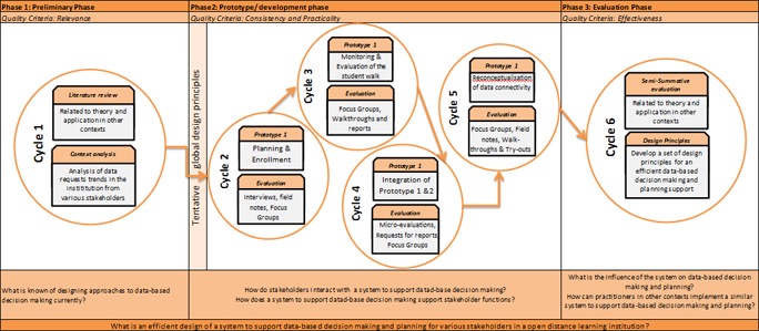
Figure 2. Design Research Process for DigitalDNA, including research
questions and Evaluative Foci.
The following section describes the final prototype and its application in the Higher Education Context. An exemplary case study is employed for this purpose.
The rest of the articles is devoted to illustrating the product of the Design Research process, DigitalDNA, as well as the design principles or contribution to the academic body of knowledge, allowing for transferabitity. This is accomplished by means of an example of how the Digital Decision Network Application, known as DigitalDNA, can be used to facilitate real-time data exploration will be presented in order to illustrate how the central, enriched database can be leveraged to provide actionable, timely data to stakeholders with diverse needs. We will launch the discussion by discussing the design logic employed in the development of this data exploration environment, followed by an example of the application and illustration of the node access screens (dashboards), as well as a discussion of the various data exploration approaches.
The DigitalDNA development started off with the following tentative global design principles established through contextual needs analysis at Unisa and literature review which constituted the Preliminary Design Research Phase:
In this illustrative case we will examine data with pertaining to teaching and learning. DigitalDNA in this case is layered around three entry nodes (See Figure 3):
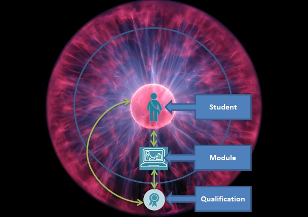
Figure 3. DigitalDNA data sphere.
DigitalDNA holds the real-time, enriched and quality assured data warehouse. Users can enter DigitalDNA to start their exploration at any one of these nodes using either a student identifier (e.g., name, date of birth, student number), module identifier (e.g., module code, module name, navigation through the curriculum structure), or qualification identifier (e.g., qualification code, qualification name, navigating through the organisational architecture). Once a user has entered any of the layers, they are presented with a dashboard which provides key information for the particular student, module, or qualification they are exploring; a signboard to orientate the user to what is available for exploration in that layer of data, based on a certain level of granularity. These dashboards act as the layout map for each level to show what aspects can be explored at the particular level of granularity. Once a user has engaged with the primary dashboard for the level they can click on various aspects that they wish to explore further, either moving through data on the same level (drill through, 360°), or shifting their exploration of the data to another level (drill down or roll up). Moving through and between levels is facilitated through catalysts in the form of student, module, and qualification identifiers.
The idea is similar to exploring a multi-storey department store (see Figure 4). Each node (student, module, or qualification) would represent a different department (data-level). Each department is located on its own floor. You navigate between the floors (data-levels) by using the elevator (catalysts - student, module, and qualification identifiers). When you reach the specific store you need to select which department (data layer) to go to and use the lift to go to the relevant floor by using your entry key (node identifier). Once the elevator door opens you are confronted with a sign-board showcasing what is available on that particular floor and you can decide which areas to visit (floor map or node dashboard). When you have finished on a particular floor, you may want to move to another floor and thus, use the elevator (catalysts or node identifiers: student, module, or qualification identifiers) again to navigate to a new floor, to explore what is available in more depth. We will now illustrate how DigitalDNA can be employed through an enrolment management example relevant to the higher education environment.
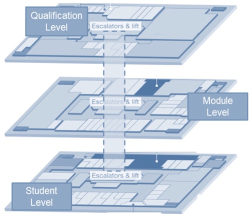
Figure 4. DigitalDNA as a multi-storey data department store.
A college (faculty) planning workshop is taking place. The purpose of the meeting is to establish qualification enrolment targets for the 2016 cohort.
The workshop is attended by the:
Initial discussions and engagement has resulted in the development of draft targets which have been captured on a planning spreadsheet to capture targets from 2016 to 2019. These targets now need to be interrogated to examine if they are feasible and where action is required to achieve the targets.
A data exploration will now take place using the data DigitalDNA to determine which qualification targets may be problematic and to explore how to either achieve these targets or adjust the targets. An example of such a spreadsheet is provided in Figure 5 below.
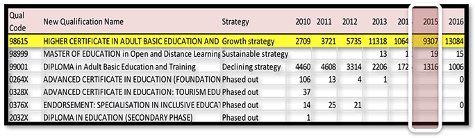
Figure 5. Excerpt of Qualification History and Targets Set for 2016.
The data exploration approach employed in this case emphasises identification of problem areas and then diagnostic exploration to have comprehensive data to facilitate planning and decision making. As such, the first step is to identify the targets that warrant further exploration in this case.
From Figure 5 it can be seen that the targets envisaged for the Qualification 98615 (Higher Certificate in Adult and Basic Education and Training) may be problematic given the recent enrolment history. Whilst enrolment increased steadily from 2010 to 2012 and showed a jump in 2013, there has been a steady decrease in enrolments since 2014. The new enrolment targets require a more than 40% growth, not only altering the trend of decreased enrolment, but requiring higher intakes than have been achieved in the last six years. This proposal should thus be explored in greater depth and seen from a range of different perspectives to determine if the proposal is reasonable. As we are using the new data DigitalDNA exploration approach we need not request a full examination by our Information and Analysis Directorate, but merely request that the analyst, present in the session, uses DigitalDNA to explore the data for this qualification in real-time so that we may engage with it.
In exploring this qualification we want to examine a number of aspects in order to make and informed decision and plan actions to achieve our targets. These aspects can be seen as possible viewpoints during our data exploration journey (see Table 2).
Table 2
Possible Viewpoints for Exploration
| Viewpoints | Possible question | |
| 1 | Equivalents |
|
| 2 | Attrition analysis |
|
| 3 | Qualification Flow Planning |
|
| 4 | Cohort |
|
| 5 | Risk Management |
|
Our first step in this journey is to enter DigitalDNA at one of the nodes. In this case, it is the qualifications node; however, before we explore this fully, we need to determine if there are any equivalents to the current qualification naming and number allocation. Specifically, how do previous versions of the qualification contribute to enrolments and graduates? This is explored through the Equivalents view, which in this case shows us that while there is a previous equivalent qualification, only one student from the previous qualification is still busy completing and students will no longer be able to enrol in the old qualification code. The old qualification enrolment numbers have already been incorporated into the new code. We are thus free to explore this qualification employing only the new qualification code (Figure 6).
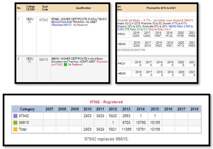
Figure 6. Three Excerpts of the Digital DNA2 equivalence view.
Now that we have identified the relevant qualification code, we can examine this data-level further. Our first stop is the attrition view: What is the pool of interest and potential uptake? Here we have an overview of the various types of attrition taking place (see Figure 7).
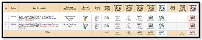
Figure 7. Attrition view.
The attrition view considers data from applications through to final registrations and active students submitted for statutory purposes. This view enables a rich understanding of the various points of attrition along that trajectory.
Our next point of interest is to see the inflow/outflow and planning over time, thus the Qualification Flow Planning View. We can explore current and historical enrolment data: What are the inflows and outflows - intake, first time intake, returning, dropouts and graduates? We can also explore scenarios to achieve growth: How many provisional enrolments are required to achieve the official census date targets and what is the required workload? The two excerpts from the Qualification Flow Planning view are provided below in Figures 8 and 9.
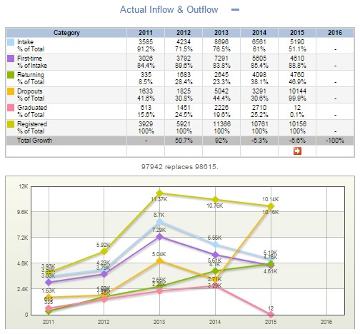
Figure 8. Excerpt qualification flow planning view - actual inflow and
outflow.
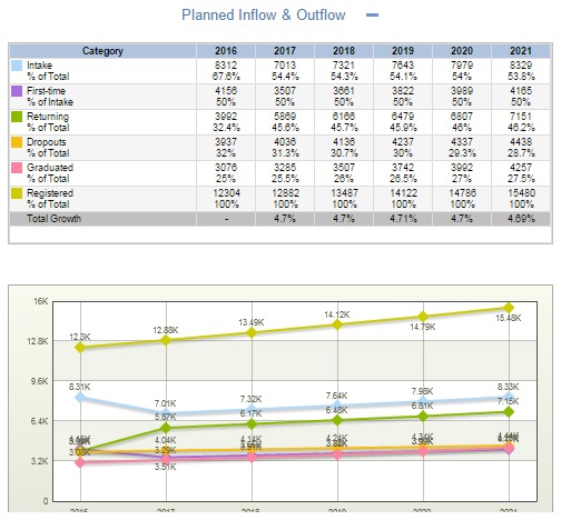
Figure 9. Excerpt qualification flow planning view - planned inflow and
outflow.
As a next step in our exploration we wish to examine (profile) the students within this qualification. As with all the other views, the cohort view is highly flexible and the user can select the information he or she wishes to engage with (see Figure 10).
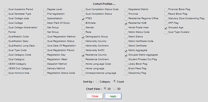
Figure 10. Excerpt cohort view - profile display options.
In this first selection, we are examining: What is the race, gender, matric score, and age distribution of the students in this qualification? (see output in Figure 11)
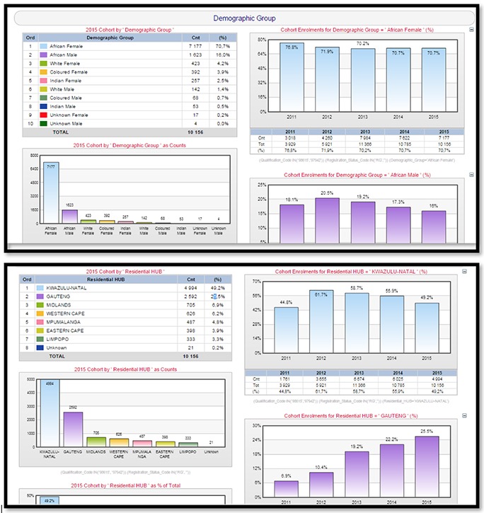
Figure 11. Excerpts cohort view.
Finally, we pay a visit to the Risk Management View: What modules are included in this qualification and how many of these modules have been deemed as "at-risk"? What risk aspects are defined for this qualification? The main Risk Management View condenses multiple indicators into one succinct view. In our case we are interested in which modules have been deemed "at-risk" or "high-risk" (last 2 columns). We are also interested in any modules included in these qualifications which have seen a decrease in the Normal exam pass rate (NPR)3. These three modules can thus be identified for additional support to improve the pass rate (see Figure 12).
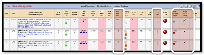
Figure 12. Excerpts risk management view.
This data exploration process takes place in real-time during the college planning workshop, ensuring relevant, accurate, and timely data is available to make the decisions. As the exploration progresses, the participants may explore certain avenues and determine what is or is not relevant to the discussion and problem at hand. The data exploration is logged and exported into a report to support and document the decisions taken at the workshop. Based on the comprehensive real-time exploration the group could establish the pool of interest, pool of suitable candidates, points of possible attrition, geographical distribution of students, student profiles, and success and barriers to graduation. With this information it is possible to decide whether the envisaged enrolment target is feasible, and if so, what is required to achieve it.
In this example the participants in the workshop decide that although the enrolment in this qualification has decreased over the last few years, there is a high enough pool of interest that the 2016 target could be achieved. It is clear, however, that some interventions will be required to attain this target. The attrition view shows that while there is a high interest in the qualification (80,195 applications), this does not necessarily convert into enrolments (36,759 registrations); this may be because many students see this qualification as a second or third choice. The attrition rate (from application phase) for this qualification is very high (54%) and there are also a number of high-risk modules in the qualification. Providing additional support for these modules may ameliorate some barriers to success for this qualification. The envisaged 2016 enrolment target is thus approved with the following interventions to be put in place:
Marketing:
Resource allocation:
The example provided above was for management planning purposes at a high level. However, DigitalDNA is designed in such a way to allow for multiple levels of exploration for various users. Exploration must be made possible for users dealing with various entry nodes and users who have varying levels of data literacy and knowledge of the system. In addition, role based access is facilitated to ensure dissemination of appropriate data and information to users. As such, three supporting features are essential: the entry node dashboard (data-level floor plan), providing suggestions for exploration (suggested itineraries), and the ability to move between the various data-levels at will (catalysts or elevators). These are discussed shortly.
Users can access DigitalDNA at three nodule entry points: student, module, and qualification. The node dashboard is the first data view that the user will be confronted with once they enter a data-level. This will provide a quick overview of the data available at that level with click through and click around capabilities. This is a simple diagnostic view which allows the user to see which aspects they are concerned about for the student, module, or qualification they are exploring and provide them with the opportunity to visit different aspects for more information about these areas of concern. An example of the student node dashboard is shown in Figure 13 below to illustrate this. The data drawn for this dashboard is from the same DigitalDNA system and users can easily click through and explore to a more aggregated level from here all the way to the qualificiation level where we started our illustrative case.

Figure 13. Excerpt student node dashboard.
Information is "on demand"; the various sections open depending on the interest and requirements of the user. An example of an "expanded" section for habits and behaviours alone is given in Figure 14. A multitude of data is thus available for this student on demand.
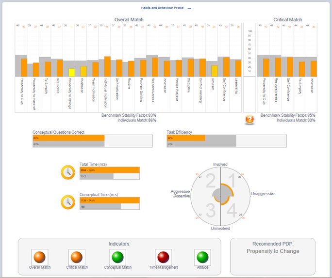
Figure 14. Excerpt student node dashboard expanded for habits and
behaviour.
DigitalDNA can be quite overwhelming for new users, particularly as most users move from having difficulty to access any data to having a wealth of navigable data at multiple levels of granularity and aggregation at their fingertips. To support users who are making their first forays into exploring DigitalDNA, certain suggested itineraries have been developed for common types of explorations (Table 3).
Table 4
Example Itineraries
| Reason for exploration | Suggested view points |
| Quality assurance | Qualification or Module Quality Assurance Metrics or Aggregated Quality Assurance Metrics. |
| Risk analysis | Qualification Risk Rankings; Module Risk Identification; Module "At-Risk" Report; Student Progression Risk. |
| Profiling | Qualification Cohort Profile; Module Cohort Profile; Current and Planned Enrolment Profile; Current Student Profile; Student Habits and Behaviour Profile. |
| Predictive analytics | Qualification Inflow/Outflow Modelling; Qualification Retention and Success Predictions; Module Attrition and Success Predictions. |
| Success analyses | Qualification Throughput and Success; Module Examination Success. |
These itineraries suggest certain viewpoints which may be of value when confronted with various decisions and challenges. Of course the user may deviate and use their own exploration, but it is suggested that at minimum these views are explored.
The real power of DigitalDNA is the ease of navigation, not just within each data-level, but between the various levels. This is facilitated through a navigation bar consisting of a collection of icons that allows the user to jump from one data layer to another at will to further the data exploration. These bars are located in various places in the design of the dashboard (see Figure 15 below). It is also possible to click on any of the modules in the curriculum window to act as catalysts to explore the module level in depth.

Figure 15. Example report with various navigation bars.
In the the screen shown in Figure 15 not only the navigation bar is click-able, but any user can click through from this qualification level to any of the modules on the right. This would allow for exploration of the various modules contributing to the overall qualification.
The DigitalDNA approach to data exploration presented in this article represents several shifts in the way that dashboard design and visualisation is usually approached. From a design perspective, a distinction is drawn between visualisations for learning analytics and for broader applications as decision support systems (DSS). While the DigitalDNA development has the student as an identified agent, the construct is more comparable with DSS development than with learner analytics visualisations. The DigitalDNA development can be classified as part of the Data-driven DSS toolset as described by Kacprzyk and Zadrozny (2007). The primary design concern is data integrity and linkage with a number of centrally enriched data sets. This means that exploration logic now becomes the focus as opposed to the needs of a particular user or the capabilities and interface of any particular dashboard development software. The focus is also not on data visualisation and memorability, but rather on having real-time navigable data with various displays for users to choose from. In addition, effort is given to link multiple data points in a way that is logical to the user. The user may thus identify and explore areas of concern of data surrounding key nodes, with the ability to extensively drill through, drill down, and aggregate upwards. The shift is thus from canned (pre-packaged) reporting in the form of dashboards to the flexibility of exploration (on demand) of data at will with an export functionality to capture the real-time exploration.
DigitalDNA approach caters for the highest level of user with the highest level of data literacy. It becomes a bank of all the possible data available. Any subset of this data can now be easily drawn into dashboards and score cards for users with lower levels of data literacy and more basic data needs. As all data is located in one warehouse with enrichment taking place prior to extraction, it becomes easier to apply business rules consistently and ensure data quality. This approach to data exploration has the added benefit of shifting from a situation where data is pushed onto the users to a pull approach where users can identify and explore only the data which is of real concern to them. Consult Table 5 for a summary of the shifts in approach.
Table 5
Shifts from Dashboards to Digital DNA
| Dashboard | DigitalDNA |
| Memorability & visualisation | Navigability & flexibility |
| Needs and requirements of user | Exploration logic |
| Capabilities of particular tool | Any software can overlay |
| Sub-sets of purposefully enriched data | Integrity and linkages of enriched database |
| Pre-packaged reporting (Push) | Reporting on demand (Pull) |
The next step in the research and development will focus on visualisation in order to make navigation and exploration more intuitive. There will also be a focus on how to help users to identify possible problem areas for further exploration more easily out of the node dashboards.
The aim of this article is not to market a particular application, but to illustrate a new approach to present vast quantities of data to users for sense-making. It attempts to show the shifts in design logic required to make data exploration and navigation more accessible and dynamic as the data available in Higher Education mushrooms. It emphasises a shift from a fragmented user focused dashboard development approach to networked data exploration which employs dynamic dashboards to facilitate data exploration and navigation. This represents a paradigm shift from the traditional approach which emphasizes memorability and visualisation.
1. Official audit data captured on a specific date for Higher Education Institution in South Africa is known as HEMIS (Higher Education Information Management System) data. This is the basis for subsidy allocation by government.
2. All Excerpts are from the DigitalDNA System from this point forward.
3. Normal exam pass rate - the number passed relative to those that wrote (no deferments) - the field shows the previous year pass rate, an indicator of change (up or down) and the current year pass rate
Abd-elfattah, M., Alghamdi, T., & Amer, E. (2014). Dashboard technology based solution to decision making. International Journal of Computer Science Engineering, 4(2), 59-70.
Anderson, T., & Shattuck, J. (2012). Design-based research: A decade of progress in education research? Educational Researcher, 41(1), 16-25. doi: http://doi.org/10.3102/0013189X11428813
Archer, E., & Chetty, Y. (2013). Graduate employability: Conceptualisation and findings from the University of South Africa. Progressio, 35(1), 134-165.
Archer, E., & Howie, S. (2013). South Africa: Optimising a feedback system for monitoring learner performance in primary schools. In T. Plomp, & N. Nieveen (Eds.), Educational design research - Part B: Illustrative cases (pp. 71-93). Enschede: Netherlands Institute for Curriculum Development (SLO). doi: http://international.slo.nl/bestanden/Ch01-51_total.pdf
Barab, S., & Squire, K. (2004). Design-based research: Putting a stake in the ground. Journal of the Learning Sciences, 13(1), 1-14. doi: http://doi.org/10.1207/s15327809jls1301_1
Booth, M. (2012). Learning analytics: The new black. EDUCAUSEreview, July/August, 52-53. Retrieved from http://net.educause.edu/ir/library/pdf/ERM1248P.pdf
Borkin, M. A., Vo, A. A., Bylinskii, Z., Isola, P., Sunkavalli, S., Oliva, A., & Pfister, H. (2013). What makes a data visualization memorable? IEEE Trans Vis Comput Graph, 19(12), 2306-2315. doi: http://doi.org/10.1109/TVCG.2013.234
Bresfelean, V.P., & Ghisoiu, N. (2010, February). Higher education decision making and decision support systems. WSEAS Transactions on Advances in Engineering Education, 7(2), 43-52.
Bresfelean V.P., Ghisoiu N., Lacurezeanu R., & SitarTaut D.-A. (2009). Towards the development of decision support in academic environments, Proceedings of ITI 2009, Cavtat, Croatia, 343-348.
Bresfelean V.P., Lacurezeanu R., Ani C., & Pop M. (2009). Technologies in Academic Environ ments, Proceedings of EDULEARN09, Barcelona, 2009.
Bridgstock, R. (2009). The graduate attributes we've overlooked: enhancing graduate employability through career management skills. Higher Education Research & Development, 28(1), 31-44. doi: http://doi.org/10.1080/07294360802444347
Choi, T. Y., Dooley, K. J., & Rungtusanatham, M. (2001). Supply networks and complex adaptive systems: Control versus emergence. Journal of Operations Management, 19(3), 351-366. doi: http://doi.org/10.1016/S0272-6963(00)00068-1
Collins, A., Joseph, D., & Bielaczyc, K. (2004). Design research: Theoretical and methodological issues. Journal of the Learning Sciences, 13(1), 15-42. doi: http://doi.org/10.1207/s15327809jls1301
Cook, K., Grinstein, G., & Whiting, M. (2014). The VAST challenge: History, scope, and outcomes: An introduction to the special issue. Information Visualization, 13(4), 301-312. doi: http://doi.org/10.1177/1473871613490678
Council on Higher Education. (2016). South African higher education reviewed. Two decades of democracy. Higher education reviewed. Pretoria: CHE. doi: http://doi.org/10.1080/02642060701453288
Davis, A., & Blass, E. (2007). The future workplace: Views from the floor. Futures, 39(1), 38-52. doi: http://doi.org/10.1016/j.futures.2006.03.003
Department of Higher Education and Training [DHET]. (2014). White paper for post-school education and training: Building an expanded, effective and integrated post-school education system. Government Gazette, 11(37229), 3-11.
Department of Education [DoE]. (1997). Education white paper 3: A programme for the transformation of higher education. Pretoria: Department of Education. Retrieved from http://scholar.google.com/scholar?hl=en&btnG=Search&q=intitle:Education+White+Paper+3:+A+programme+for+the+transformation+of+Higher+Education#3
Dooley, K. J. (1997). A complex adaptive systems model of organization change. Nonlinear Dynamics, Psychology, and Life, 1(1), 69-97. doi: http://doi.org/10.1023/a:1022375910940
Dougherty, F. L., Ambler, N. P., & Triantis, K. P. (2016). A complex adaptive systems approach for productive efficiency analysis: building blocks and associative inferences. Annals of Operations Research, February. doi: http://doi.org/10.1007/s10479-016-2134-3
Fakeeh, K. A. (2015). Decision support systems (DSS) in higher education system. International Journal of Applied Information Systems, 9(2), 32-40. Retrieved from http://research.ijais.org/volume9/number2/ijais15-451366.pdf
Few, S. (2006). Information dashboard design: The effective visual communication of data. O'Reilly Media: Boston.
Few, S. (2007). Data visualization: Past, present, and future. IBM Cognos Innovation Center for Performance Management, 3(11). Retrieved from http://perceptualedge.com/articles/Whitepapers/Data_Visualization.pdf
Govaerts, S., Verbert, K., Duval, E., & Pardo, A. (2012). The student activity meter for awareness and self-reflection. Proceedings of Extended Abstracts on Human Factors in Computing Systems: Conference on Human Factors in Computing Systems [CHI' 12] (pp. 869-884) Austin, Texas, USA.
Govaerts, S., Verbert, K., Klerkx, J. & Duval, E. (2010). Visualizing activities for self-reflection and awareness. In X Luo, M Spaniol, L Wang, Q Li, W Nejdl, & W Zhang (Eds.) Proceedings of Advances in Web-Based Learning: 9th International Conference on Advances in Web-Based Learning [ICWL] (pp. 91-100) Shanghai, China.
Herrington, J., Mckenney, S., Reeves, T., & Oliver, R. (2007). Design-based research and doctoral students: Guidelines for preparing a dissertation proposal. In C Montgomerie & J Seale Proceedings of World Conference on Educational Multimedia, Hypermedia and Telecommunications 2007 (pp. 4089-4097).
Hodgson, G. M. (2016). The future of work in the twenty-first century. Journal of Economic Issues (M.E. Sharpe Inc.), 50(1), 197-216. doi: http://doi.org/10.1080/00213624.2016.1148469
Innovation Labs Strategic Solutions. (2007). National alliance discovery workshop document. Retrieved from http://www.innovationlabs.com/summit/discovery1
Kacprzyk J., & Zadrozny S., (2007) Towards human consistent data-driven decision support systems via fuzzy linguistic data summaries. In I. Batyrshin, J. Kacprzyk, L Sheremetov, & L. A. Zadeh (Eds.) Perception-based data mining and decision making in economics and finance, (pp. 37-54) Berlin: SpringerVerlag.
Lewin, R., & Regine, B. (1999). The soul at work: Unleashing the power of complexity science for business success. Orion Business. Retrieved from https://books.google.co.za/books?id=koA5GgAACAAJ
McGreevy, M. (2008). Adaptive change in an evolving world of work. Industrial and Commercial Training, 40(7), 355-363. doi: http://doi.org/10.1108/00197850810912225
Newman, M., & Elbourne, D. (2004). Improving the usability of educational research: Guidelines for the REPOrting of primary empirical research studies in education (The REPOSE Guidelines). Evaluation & Research in Education, 18(4), 201-212. doi: http://doi.org/10.1080/09500790408668319
Newman, K., Thomas, E., & Webber, E. (2014). Dashboards: A window into higher education risks. URMIA Journal, 49-58.
New Media Consortium. (2013). Horizon report: 2013 Higher education edition. New Media Consortium: Austin.
Nieveen, N., & Folmer, E. (2013). Formative evaluation in educational design research. In T. Plomp, & N. Nieveen (Eds.), Educational design research - Part A: An introduction (pp. 152-169). SLO, Enschede.
Pillay, S. R. (2016). Silence is violence: (critical) psychology in an era of Rhodes must fall and fees must fall. South African Journal of Psychology, 46(2), 155-159. doi: http://doi.org/10.1177/0081246316636766
Plomp, T. (2013). Educational design research: An introduction. In T. Plomp, & N. Nieveen (Eds.), Educational Design Research - Part A: An Introduction (pp. 10-51). SLO, Enschede.
Prinsloo, P., Archer, E., Barnes, G., Chetty, Y., & Zyl, D. Van. (2015). Big(ger) data as better data in open distance learning. The International Review of Research in Open and Distributed Learning, 16(1), 284-306.
Sokolova, M. Fernández-Caballero, A., & Gómez, F. (2011). A review on frameworks for decision support systems for environmental domains. Proceedings of the 4th Revisita EIDOS [Online]. Retrieved from https://www.ute.edu.ec/posgrados/eidos4/art-11.html
Susnea, E. (2013) Improving decision making process in universities: A conceptual model of intelligent decision support system. Proceedings of the 5th International Conference EDU-WORLD 2012 - Education Facing Contemporary World Issues, (pp. 795-800) University of Pitesti, Romania.
UNESCO. (1998). World declaration on higher education for the twenty-first century: Vision and action. Retrieved from http://www.unesco.org/education/educprog/wche/declaration_eng.htm
UNESCO. (2015). Rethinking education. Towards a global common good? Paris: United Nations Education, Scientific & Cultural Organization.
Van den Akker, J. (2013). Curricular development research as a specimen of educational design research. In T. Plomp, & N. Nieveen (Eds.), Educational design research - Part A: An introduction (pp. 52-71). SLO, Enschede.
Van Den Akker, J., Gravemeijer, K., McKenney, S., & Nieveen, N. (2006). Educational design research. Design. London: Routledge.
Van der Merwe, L., & Verwey, A. (2008). Leadership meta-competencies for the future world of work: An explorative stury in the retail industry. SA Journal of Human Resource Management, 5(2), 33-41. Retrieved from http://www.sajhrm.co.za/index.php/sajhrm/article/viewFile/117/137
Verbert, K., Duval, E., Klerkx, J., Govaerts, S., & Luis Santos, J. (2013). Learning analytics dashboard applications. American Behavioral Scientist, 17(10), 1500-1509. doi: 10.1177/0002764213479363
Verbert, K., Govaerts, S., Duval, E., Parra, G., & Klerkx, J. (2014). Learning dashboards: An overview and future research opportunities. Personal and Ubiquitous Computing, 18(6), 1499-1514. doi: http://doi.org/10.1007/s00779-013-0751-2
Wang, F., & Hannafin, M. J. (2005). Design-based research and technology-enhanced learning environments. Educational Technology Research and Development, 53(4), 5-23. doi: http://doi.org/10.1007/BF02504682
Watters, A. (2013, October 13). Student data is the new oil: MOOCs, metaphor, and money. [Web log post]. Retrieved from http://www.hackeducation.com/2013/10/17/student-data-is-the-new-oil
Wishon, G.D., & Rome, J. (2012). Enabling a data-driven university. EDUCAUSEreview: Why IT Matters in Education, 13 August 2012. Retrieved from http://www.educause.edu/ero/article/enabling-data-driven-university
Yorke, M. (2006). Employability in higher education: what it is - what it is not. Learning, (May), 1-20. doi: http://doi.org/10.1007/s11233-005-5110-z
![]()

Revisiting
Sensemaking: The case of the Digital Decision Network Application
(DigitalDNA) by Elizabeth Archer and Glen Barnes is licensed under
a Creative Commons
Attribution 4.0 International License.